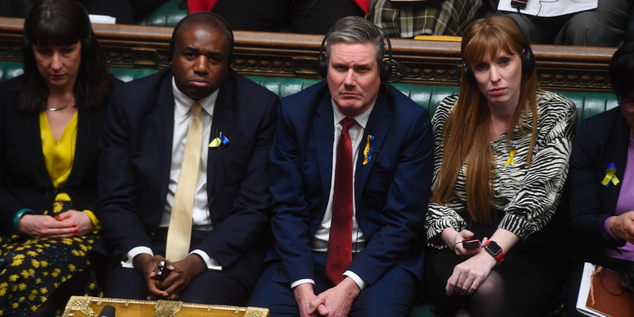
The Conservative Party has unveiled its ground-breaking strategy for the upcoming election season: a poster that will exclusively feature the Labour front bench. This move, described by some as “bold” and others as “merciless,” aims to convey a simple yet compelling message to the voting populace.
Gone are the days of intricate policy discussions and lengthy manifestos; the Tories have opted for the minimalist route. The poster, set against a tasteful backdrop of bureaucratic beige, will showcase the Labour front bench in all their somber glory, unaccompanied by flashy graphics or persuasive slogans.
“We believe in letting the images speak for themselves,” said the Conservative campaign director, with a sly grin. “Why distract voters with words when they can just take a long, hard look at the alternative?”
Critics argue that this move might be too subtle, with concerns that some voters might miss the nuanced messaging. However, the Tories are confident that the mere sight of the Labour front bench will speak volumes about what they term “the perils of overambitious government intervention.”
“We considered adding fireworks or maybe a dancing bear, but we thought, why gild the lily?” said the campaign director. “The Labour front bench is our gift to the nation, and we’re just here to share it.”
The minimalist approach has garnered mixed reactions, with some lauding the Conservatives for cutting through the noise and others wondering if this is an elaborate attempt at avant-garde political commentary.
As election season heats up, one thing is clear: the Tories are banking on the old adage that a picture is worth a thousand words, even if those words are, in this case, a silent plea for an alternative.


